On Not Hitting The Bell Every Time
Well, OK. It's a good prototype:
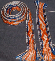
Here's the wool band, alongside the first incarnation with the larger weft. You can see how much difference the weft choice made, but, alas, it was not enough. The design is too elongated, a factor of yarn size, and I think the pattern needs to be a little more complex.
Sylvia commented on the colors, and yes, they are not my *usual*. They were chosen to go with this:
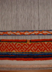
The band will be used as a handle on this eventual bag. What this picture illustrates *very* well though, much to my chagrin, is the color problem I have when working with pile: the cut end of the yarn, bunched up as it is in knots, looks much different, colorwise, than the side of the yarn.
So, to make a long story even longer, I should have realized at the outset that the band colors would not match the pile colors, even though I was using the same yarn. Duh.
Looks like more spinning, dyeing and weaving is in my future, watch this space.
To put a happy ending on it:
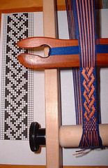
I warped up the little braid pattern in some 5/2 cotton, and it's weaving along nicely. It will make a fine demo band for CNCH, and now I'll have a sample, and a new draft to add to my collection.

Here's the wool band, alongside the first incarnation with the larger weft. You can see how much difference the weft choice made, but, alas, it was not enough. The design is too elongated, a factor of yarn size, and I think the pattern needs to be a little more complex.
Sylvia commented on the colors, and yes, they are not my *usual*. They were chosen to go with this:

The band will be used as a handle on this eventual bag. What this picture illustrates *very* well though, much to my chagrin, is the color problem I have when working with pile: the cut end of the yarn, bunched up as it is in knots, looks much different, colorwise, than the side of the yarn.
So, to make a long story even longer, I should have realized at the outset that the band colors would not match the pile colors, even though I was using the same yarn. Duh.
Looks like more spinning, dyeing and weaving is in my future, watch this space.
To put a happy ending on it:

I warped up the little braid pattern in some 5/2 cotton, and it's weaving along nicely. It will make a fine demo band for CNCH, and now I'll have a sample, and a new draft to add to my collection.

3 Comments:
The difference in depth of shade is startling!!! I've been thinking all evening about your orange-cream-blue design and I think it's too much positive space. Could you dye the orange a bit darker and use more of it, making the cream bits narrower? How avout a blue zig in place of one diagonal row of cream? The blue (on screen anyway) doesn't seem to have such a marked difference in shade. Unless you're going to use dots in the bag, I'd axe the dots in the band. I am fascinated by the cut vs. side refraction issue. NEAT CONCEPT!
hmm, with the bag band, what if you take a yellow warp? In the pile stuff the warp isn't really showing, but it looks to be yellow that makes the patterning in the orange/red, so if you have warp showing in the band, make that yellow instead of the cream color.
Seems the cream color pile appeasrs darker as a "pile" and surrounded by the other colors.
I'm with Maus....it's the cream that jars my eye. The cream in the cut pile 'reads' as yellow (at least on my monitor with my eyes).
Post a Comment
<< Home